
//Theme//
I created this for an art competition with no limits on media or theme. That sounds like it could be awesome, right? But it's difficult to be completely creative without any guidelines or constraints, so I had to create my own. As you probably already know, I am always inspired by nature, so I knew I wanted to focus on that as my subject. I've also been focusing my art-making lately on watercolors and contour illustrations, so I knew I wanted to use both as my media of choice. It seemed like a natural reflection of what I've currently been practicing and developing style-wise.
//Media Test//
However, first, to be sure I wasn't trekking down a path I would later regret, I did a media test:

It verified that the pen ink wouldn't run if I painted over it, I loved the way it turned out, and the colors I happened to pick for the media test sparked the conceptual idea I knew I wanted to move forward with. I had been thinking lately how all of the colors on a computer screen are composed of red, green, and blue light, and how the color makeup for light differs from the color combos for pigment. Also, I had been thinking and composing my thoughts on the role electronic media plays in influencing one's sense of wonder (you can see my thoughts here). Using those thoughts as a springboard, I came to the conclusion that technology can support and increase wonder if used intentionally for such a purpose, and nature's wonders and modern perspective can work together to form a new and refreshing viewpoint.
Having that theme in mind, I got to work executing it.
//Artwork Prep//
I determined my canvas size and measured and taped off my working area. Then, I chose which items to include ensuring a balance of bones, feathers, cones, wood, and miscellaneous smaller finds. I decided to keep everything life-sized because 1) it is how I usually draw my contour illustrations and 2) I wanted to show the details of each nature find in relation to one another. Using an assortment of tracings I had previously made of natural items and additional found items, I arranged them on my work space:
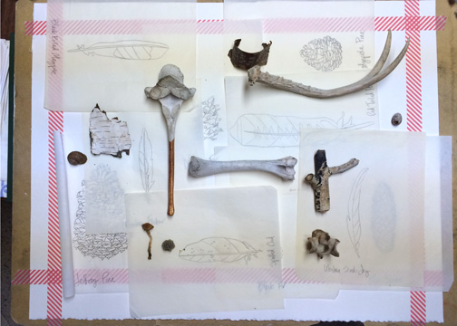
I wanted to keep everything clean and orderly in a grid pattern to allow for the natural shapes and details to shine. If I had piled everything together, I'm afraid it would have looked too busy. Also, the clean grid in which the items were placed supported the "modern" portion of my "Modern Wonder" theme. After evaluating the balance of items, I arranged and then rearranged the items until I felt good about the general placement:

//Pencil Sketch//
The next step was to transfer all the images to the final paper. I started with larger items first and rearranged and adjusted the placement of the remaining pieces as I finished the pencil sketch:


It worked well to adjust the placement of the items as I transferred my sketches because by the end, I had to add in a few more items that I hadn't initially planned for. However, because I had been paying careful attention to the spacing and balance of like objects, I knew exactly what kinds of items to add in last minute to fill out the overall composition:

//Pencil Sketch Adjustments//
Sketching the placement of all the items in pencil instead of pen allowed me to view the piece as a whole once the sketch was finished:

I looked over every detail of each item and the piece as a whole. Then I erased and re-sketched items if they seemed out of place, crooked, or too close or far to the edges of the final artwork or other items.
//Pen Contour//
The next step was to go over all the pencil drawings in pen. Although I had complete pencil contours, I had kept them pretty light in order to keep them erasable. I used my tracings and the actual items for reference on detail and started the pen contour, which is my favorite part:


I love this step because it is methodical, and because it's exciting to watch the final piece come to life. All steps prior to this are for preparation, and while the preparations shows through the final piece, the actual work does not. Even though by this step I had drawn and redrawn each item several times, I enjoyed the careful process of slowly revealing the details of each item. To prevent myself from drawing what I imagined should be there instead of what I was actually seeing, I broke up some of the larger, more detailed pieces as I went along. For this particular piece, because of the size and the number of items, I found it easier to lightly erase as I finished an item's contour to prevent unnecessary smudging.
//Cleanup and Final Pen Contour//
After adding in details with the pen, I scrutinized every item on its own, as well as all the edges of my paper and carefully erased and cleaned up every smudge. It's difficult to erase pencil smudges once they have a layer of paint over them, so I made sure to do this step several times:

//Watercolor Layer//
All that was left after finishing the illustration was to add the watercolor layer. I determined ahead of time the color of a few key anchor items and then filled in the rest with whichever remaining colors balanced the best. In order to keep this style feeling modern, I echoed the general shape of each item, like an off-set print. I hoped it would keep the final piece from looking too busy and would support the natural shape of the found items. I think the color added a lot to the piece, and I'm happy with the way it turned out. Then, after signing it, I put it in the prepared frame:

I love this!
ReplyDeleteThanks! You always have such kind things to say!
Delete