Lover of nature, color, art, life, adventure. Choosing to find beauty. I hope you can find inspiration and joy while you're here.
Showing posts with label Watercolor. Show all posts

1.03.2016

Mess Ups

Guys, I'm not always proud of the art I create. Sometimes I make big errors where nothing can salvage the art, so I usually chuck them in the trash and don't post such nonsense. Then from my frustration I find the energy to keep moving forward, whether it be in the form of another project or taking a second (or third or forth!) stab at a piece of art until I like where it lands. It's a matter of resiliency. Lest you think art always comes easy to me, ta-da:


I think the moose has such a sad look on his face because he knew I would mess up royally on the watercolor after spending too long on the stipple illustration detail. Sorry, big fella! #momentoftruth #shechosepoorly

12.20.2015

Autumn Leaf Watercolor How-To

After my personal project series for November (a set of watercolor autumn leaves), I thought it might be fun to give a quick tutorial using one of the paintings from the series:


First step, sketch out the shape. I use a super light touch when drawing because pencil can been easily seen through watercolor paints but can be erased once the paint is dry. Sometimes I even go over my pencil lines with an eraser to make it as light as possible before painting. On this leaf, I didn't draw every single detail, it was just a quick contour drawing of the leaf outline.

Next, painting! I start with the lightest paint colors first:


On this leaf, I laid down a layer of light yellow with a medium round brush, and while it was still wet, I added touches of green using just the tip for smaller strokes. That way, the colors blended on their own to create a variety of shades. I went over this a couple more times, adding more pigment in a couple of places to make the color differences more vivid.

Lastly, the final touches:


While the painting was just slightly wet, I added a small touch of red for the veins, using a light touch with just the tip of my brush, knowing that the veins would bleed out wider because the paper was still wet.

Once the paint is totally dry, I do over the edges of the shape lightly with an eraser to pick up any pencil lines that haven't been covered by the paint. It cleans up the edges and makes the image look sharper. Then, I sign that sucker, and in this case labeled it on the back, and moved on to the next one.

Today is the last day to get the special introductory rate on the leaf bundles from this series. Tomorrow the price increases to $90, so be sure to stop by the shop and check out the other artwork up on in there too!

12.13.2015

Autumn Leaf Watercolor Series Part III

Here is the last grouping of leaves I created for the November leaf series on Instagram:


These limited sets are available in color bundles in my shop at an introductory price of only $75 for a set of 6 paintings. It makes me giddy to see the leaves in their color families:


There are only 4 sets of paintings available, so only the first 4 people will get this special rate for early purchasers. On December 21st, they go up to the full price of $90, so if you've been waiting for a good deal on nature artwork, this is it!

Thanks for your continual support by reading! I'm happy to know others are enjoying this space and sharing the wonders of nature too!

12.06.2015

Autumn Leaf Watercolor Series Part II

Here are the next 9 paintings from November's series:


I'm happy to say that some of these paintings are up for sale in my shop! I've bundled them in color groupings because each color exudes a certain feeling: a happy yellow, a peaceful golden brown, a shy green, or a flashy red!

Each bundle of 6 is on sale right now for $75 to early purchasers, but on December 21st they will all go up to the full price of $90. There is only one set of each color grouping, too, so now's the time to snag some original watercolor artwork for your home!

Which fall leaf colors are your favorite?

11.29.2015

Autumn Leaf Watercolor Series Part I

You've probably noticed my latest nature art series if you follow my daily posts on Instagram: autumn leaves. If so, I hope you enjoyed it! Tomorrow the last leaf falls so to speak. (At least I'll be posting the last painting in this year's series. The real leaves may continue to fall.) What is your favorite thing about nature this time of year? For me, it's the unapologetic display of colors! Here are the first nine in the month-long series:


This series consists of paintings of leaves I've personally collected this autumn then painted. Is gathering fall colors a favorite pastime for you too, I hope?

Instead of drawing these geometric-style like I was planning on, I realized that what I needed to focus on the most was allowing the colors to shine through. So, I switched things up for the month of November by showing a watercolor series.

I'm amazed at the way each tree adjusts to seasonal change on its own and on a smaller scale how each leaf on the same tree does the same: changing in its own time and shining in its own way. Gosh, I'm so lucky to live in a place that gets to enjoy the best season ever invented!

9.24.2015

Moment of Wonder: Bighorn Sheep

One of my most memorable moments of wonder happened earlier this year while hiking with a friend. It had snowed the night before and the canyon was full of the kind of frosty fog that leaves feathery ices crystals on every surface. With each tiny blade and twig coated in delicate winter attire, our normally straightforward hike was transformed to an otherworldly version of itself. The snow padded any sound and we walked quietly taken by the incredible beauty surrounding us and avoiding any noise that might break the spell.

As we worked our way through the fog, we were met with new scenes every few steps. It had been a long time since I had felt that overwhelming joy of discovery as strongly as I did that day. I eagerly picked my way through the snow and fog, soaking in as many details as I could, and expecting something magical to happen.

The best thing about expecting something magical is that it usually happens.

The timing could not have been any more perfect. As we neared a corner in the trail, the fog cleared just enough to see dark shapes. As I was thinking how odd it was to run into other hikers on the trail, but then as we got closer I realized the massive shapes were much larger than people. In the middle of that thought, the fog suddenly cleared, and standing in front of us were two bighorn sheep with their majestic curling horns and powerful stances. We stopped short and I locked eyes with one of them, and in that moment there was no fear from either of us, but a mutual acknowledgement. The brief encounter seemed to last for eternity, and in that moment I felt I was privileged to share in the strength and wild wisdom of that creature.

Then just as quickly as they appeared, they turned and climbed up the cliff wall bordering the trail, without leaving any sign they had been there at all. It was so magical I still sometimes question if it really happened, especially when I walk past that same spot and marvel at the sheerness of the cliff they disappeared up so effortlessly.

From the foggy setting to the hoofsteps echoing through the cold, the moment could not have been any more magical. And while that magic cannot be replicated, I hoped to be able to convey the fearlessness and strength I gained in that moment with an illustration and watercolor piece, which will be up in the shop soon:


Here's hoping something magical brings you delight and the joy of discovery this week!

9.14.2015

Aspen Branch Illustration and Watercolor

This is one of my favorite recent pieces:


I love the contrast of the clean controlled contour against the organic watercolor. It's been refreshing to let go a little more. This will soon be available in the store along with some other nature-inspired art!

6.25.2015

Fracture Watercolors

I've been working on these patterned watercolor pieces:


I loved the pattern and color variance so much, that I decided to do these in three different colors. I think I like the teal the best, although the green is a close runner up.

6.07.2015

Owl Feather Illustration and Watercolor

Here's another watercolor/illustration combo that I've done recently:


I love the way it turned out and I'm excited to try more pieces in this style!

6.04.2015

Dove Watercolors

Here is a pair of peaceful periwinkle doves to help calm your day:


I love how being around nature and noting the lovely details is an instant stress reliever!

5.31.2015

Case Study- Modern Wonder Illustration

I recently finished a large illustration and watercolor piece and would love to walk you the process if you'd like to see:


//Theme//
I created this for an art competition with no limits on media or theme. That sounds like it could be awesome, right? But it's difficult to be completely creative without any guidelines or constraints, so I had to create my own. As you probably already know, I am always inspired by nature, so I knew I wanted to focus on that as my subject. I've also been focusing my art-making lately on watercolors and contour illustrations, so I knew I wanted to use both as my media of choice. It seemed like a natural reflection of what I've currently been practicing and developing style-wise.

//Media Test//
However, first, to be sure I wasn't trekking down a path I would later regret, I did a media test:


It verified that the pen ink wouldn't run if I painted over it, I loved the way it turned out, and the colors I happened to pick for the media test sparked the conceptual idea I knew I wanted to move forward with. I had been thinking lately how all of the colors on a computer screen are composed of red, green, and blue light, and how the color makeup for light differs from the color combos for pigment. Also, I had been thinking and composing my thoughts on the role electronic media plays in influencing one's sense of wonder (you can see my thoughts here). Using those thoughts as a springboard, I came to the conclusion that technology can support and increase wonder if used intentionally for such a purpose, and nature's wonders and modern perspective can work together to form a new and refreshing viewpoint.

Having that theme in mind, I got to work executing it.

//Artwork Prep//
I determined my canvas size and measured and taped off my working area. Then, I chose which items to include ensuring a balance of bones, feathers, cones, wood, and miscellaneous smaller finds. I decided to keep everything life-sized because 1) it is how I usually draw my contour illustrations and 2) I wanted to show the details of each nature find in relation to one another. Using an assortment of tracings I had previously made of natural items and additional found items, I arranged them on my work space:


I wanted to keep everything clean and orderly in a grid pattern to allow for the natural shapes and details to shine. If I had piled everything together, I'm afraid it would have looked too busy. Also, the clean grid in which the items were placed supported the "modern" portion of my "Modern Wonder" theme. After evaluating the balance of items, I arranged and then rearranged the items until I felt good about the general placement:


//Pencil Sketch//
The next step was to transfer all the images to the final paper. I started with larger items first and rearranged and adjusted the placement of the remaining pieces as I finished the pencil sketch:


It worked well to adjust the placement of the items as I transferred my sketches because by the end, I had to add in a few more items that I hadn't initially planned for. However, because I had been paying careful attention to the spacing and balance of like objects, I knew exactly what kinds of items to add in last minute to fill out the overall composition:


//Pencil Sketch Adjustments//
Sketching the placement of all the items in pencil instead of pen allowed me to view the piece as a whole once the sketch was finished:


I looked over every detail of each item and the piece as a whole. Then I erased and re-sketched items if they seemed out of place, crooked, or too close or far to the edges of the final artwork or other items.

//Pen Contour//
The next step was to go over all the pencil drawings in pen. Although I had complete pencil contours, I had kept them pretty light in order to keep them erasable. I used my tracings and the actual items for reference on detail and started the pen contour, which is my favorite part:


I love this step because it is methodical, and because it's exciting to watch the final piece come to life. All steps prior to this are for preparation, and while the preparations shows through the final piece, the actual work does not. Even though by this step I had drawn and redrawn each item several times, I enjoyed the careful process of slowly revealing the details of each item. To prevent myself from drawing what I imagined should be there instead of what I was actually seeing, I broke up some of the larger, more detailed pieces as I went along. For this particular piece, because of the size and the number of items, I found it easier to lightly erase as I finished an item's contour to prevent unnecessary smudging.

//Cleanup and Final Pen Contour//
After adding in details with the pen, I scrutinized every item on its own, as well as all the edges of my paper and carefully erased and cleaned up every smudge. It's difficult to erase pencil smudges once they have a layer of paint over them, so I made sure to do this step several times:


//Watercolor Layer//
All that was left after finishing the illustration was to add the watercolor layer. I determined ahead of time the color of a few key anchor items and then filled in the rest with whichever remaining colors balanced the best. In order to keep this style feeling modern, I echoed the general shape of each item, like an off-set print. I hoped it would keep the final piece from looking too busy and would support the natural shape of the found items. I think the color added a lot to the piece, and I'm happy with the way it turned out. Then, after signing it, I put it in the prepared frame:


5.07.2015

Double Owl Watercolor

My sister shared a wonder-filled nature moment with me, which in turn inspired me to get painting:

She said she had been hearing a great horned owl outside her dorm window for weeks but hadn't gotten a glimpse of it. She only could appreciate the lovely bird call and imagine what the magnificent fowl might look like. After waiting for forever and searching the trees to catch a glimpse of it, she finally did! But it was even better than she imagined because there was not only one owl living outside her window...it was two! My sister told me it was a wonderful surprise, and I hope this is one of those nature connection moments she won't forget for a long time. For reals, guys! How awesome is that?!


Making connections with nature and finding those little wonder-filled moments are so important for me to keep a healthy perspective, but I've come to realize I usually need to seek them out for them to happen in the first place.

4.26.2015

Feather Contour and Watercolor

I've been fiddling about a lot lately with watercolors and contour illustrations, and tried a new way of combining the two:


I wanted to try out a new watercolor approach that wasn't as layered or detailed, and a little more abstract and free flowing. I really like the way it all turned out! I'm definitely going to be doing this some more!

What new things have you tried lately?

4.23.2015

Mountain Mother Handlettering Variations

One of my favorite pieces I've made for the the Beehive Bazaar is this 5x7 Mountain Mother handlettering piece in three different colors:


I based these off of a green one I made for my own living room, but I liked the way it looked in other cool colors as well. Which color do you like best?

4.16.2015

Columbine Contour in Lavender and Yellow

I've been working my little buns off getting things ready for the upcoming Beehive Bazaar, and one of my favorite pieces so far is this columbine contour:


Columbines are one of the most delicate and delightful mountain flowers, and I wanted the illustration and colors to reflect that. Luckily, one of these should be up for grabs on Instagram @beehivebazaar! Make sure to follow them and keep your eye open for it to win your own for free!

4.12.2015

Watercolor- Barn Owl

One of my favorite wondrous moments happened many years ago with my brother. We were wandering around an old abandoned farm and discovered a pile of owl pellets next to a silo. We think owl pellets are pretty fun to look through and after we explored the contents and marveled at the tiny bones, we continued our expedition into the silo and startled a barn owl from her roost.

I will never forget the way my heart jumped or the silent way she sailed, or her beautiful silhouette against a bright blue sky. After she flew to safer grounds, my brother and I just looked at each other and didn't say a word because neither of us wanted to break the spell. It was amazing!

As I was reminiscing on that experience, I decided it would be nice to just paint a reminder instead:


I loved sharing that moment with my brother, and what made it even better is that a barn owl is pretty much my favorite bird ever. I think they are so powerful, gorgeous, and regal. Do you have a favorite animal or bird that you find fascinating or beautiful? What is it?

3.29.2015

Watercolors Round-up

Here is a handful of pieces from some of my favorite watercolor series this last year:


Good news: these will be hanging out at the Beehive Bazaar at the beginning of May if you're interested in picking any of them up to adorn your space. Which ones do you like best? What would you like to see more of?

3.19.2015

Watercolor- Bald Eagle

So, you know those magical moments of wonder when you connect with something in nature and suddenly your whole life is seen in a new light?

I had such a moment as that with a bald eagle! I was driving down the road on a Wednesday, of all days, when I noticed a bird of prey sitting on an electrical pole straight in front of me. (I have a learned gift for spotting them.) It was obviously a Bald Eagle because they're unmistakable, but I thought it must be a decoy to keep pigeons away because there is no way a bald eagle would be hanging out in the middle of a city next to a busy road. I stopped and stared at it for a minute to double-check what I thought I saw, and it swiveled its noble head and stared straight into my soul with its bright yellow eyes! For a moment, there was nothing in the whole world except that bird and me. Pure splendor!

It sent a little jolt through my brain and I heard myself gasp out loud! It was one of my weekly highlights, that's for sure. I pretty much told everyone I talked to that day that I saw a bald eagle because I just couldn't keep it in. I knew it must be a omen of good things to come, and sure enough, less than a week later, our little family saw it again as we were playing in a nearby canyon! Bald Eagles aren't uncommon in our state, but they are usually out in more rural areas, not in the middle of a city during rush hour. Such an amazing experience!

So, in commemoration, I painted this little guy:


Gold and regal, just like the soul of the one I connected with. Have you ever seen a bald eagle in the wild? It's a spectacular sight!

3.08.2015

Case Study- Heavenly Treasures Still Life


I recently completed a large painting and thought it might be interesting to show the process from start to finish. Read on, if you'd like to see all the nitty gritty details:


//Topic//
I always paint with something in mind such as an end goal or an experience I'd like to capture. The church I belong to put out a call for submissions for an art contest, and in this case, the topic was assigned. The theme for the contest was "Tell Me the Stories of Jesus."

With a certain topic in mind, I got to thinking, which is something I'm pretty good at spending a lot of time on. I knew I didn't want to do a figure drawing because the majority of art pieces would probably be represented that way and I wanted to stand out a little more. I knew I didn't want to use a realistic art style and I knew I wanted to incorporate nature somehow because that's my thing. I knew I wanted to include symbolism to echo Christ's teaching style and use of parables and allow for flexible interpretations when others saw my art.

Because this was a tender topic for my heart (not to mention highly religious and therefore of a sensitive nature), I also prayed a lot and studied the four gospels in the Bible several times to narrow down my myriad options. I finally landed on a story that met my major goals but that I knew would also lead me down an artistic path that wasn't completely planned out ahead of time.

The story I selected to represent was Christ's Sermon on the Mount, and the teaching that struck me in particular is found in Matthew 6:

19 Lay not up for yourselves treasures upon earth, where moth and rust doth corrupt, and where thieves break through and steal:

20 But lay up for yourselves treasures in heaven, where neither moth nor rust doth corrupt, and where thieves do not break through nor steal:

21 For where your treasure is, there will your heart be also.

//Thinking//
With a topic and a theme to go off of, I then got to work thinking even more. Over a period of several months, I thought through all the details and arrived at a final concept. In the beginning, I wasn't sure how to represent heavenly treasures, but I liked the idea of a heart being with the things that are most valued.

It reminded me of our family. We spend a lot of time outdoors, and my daughter and I both tend to collect nature things on our adventures then bring them home to display. The items end up on our pianos and shelves and on our mantel. I liked the idea of a fireplace mantel being the heart of a home. And, the more I thought about it, the more I realized that the things families value most are often displayed in an intimate yet central location, such as on a mantel, so they can be respected while also appreciated. I felt I had found an excellent foundation for 'where your treasure is, there will your heart be also.'

So, I began to make lists and sketches of intangible things that I find valuable.

//Initial Sketches and Evolution//
My first quick sketch was an attempt at including items that would feel like they were part of a naturalist's collection in a jar:


The naturalist concept felt a little forced to me, and while it had the potential to be beautiful, it wasn't very practical (like, how can a candle stay lit in a closed jar?) and it seemed a little too whimsical. However, I had a few items that I found I liked and was happy to include, and I began to realize the potential of the symbolism and the idea behind openly displaying what is important to my heart. I realized this was a successful way to echo the parable-style symbolism Christ used in his teaching.

So, I took a second stab at the sketch, using the same kind of concept, but without the naturalist twist and spread out a little more, to take up an entire mantel:


The composition felt much better to me, and I loved that the new way to display allowed for more items to be included and to be more equally represented. I had been having a difficult time deciding which metaphorically represented items should be the focal point because I found them all to be equally important in obtaining. I didn't want to have anything be partially hidden or unrecognizable.

Still, I didn't love the composition entirely, so over the period of many weeks, I sketched several more versions and continually tweaked the list of heavenly treasures, playing around with the shapes and composition, adding and removing items, as well as altering which items represented which values:


Feeling satisfied that I had a solid content, I moved on to the next phase.

//Style and Media//
I knew I didn't want to portray my art in a realistic style. I was leaning toward something more modern, like a continuous black contour line drawing on white paper. I also know my strengths lean more toward the drawing rather than the painting end of the art spectrum. Even though I have spent hundreds of hours in the last year practicing and perfecting my painting skills, I also knew that a large majority of artists in our church are well-known for their realistic painting style. I wanted to avoid blending in with the other contestants.

However, one problem I ran into was the way I wanted to represent 'forgiveness.' It's an extremely important heavenly treasure, both to me personally as well as in our church, and the way I could best think to portray it was with a ombre cloth, gradually changing from red to white. Color hadn't been a part of my original plan, so my initial intention of creating a simple continuous line contour wasn't an option any longer.

I considered merging the modern continuous contour style with a light watercolor wash, like an offset print, and tried out the style to see if it worked:


Even though it was only a quick pre-paint sketch, I didn't like the way it turned out. The colors were not intense enough for me, yet somehow distracting, and I didn't think the ombre affect on the cloth was apparent enough to warrant a watercolor wash behind each individual item. It seemed like a half-hearted effort instead of a gentle reinforcement. After a lot more thought, I opted to paint the entire art piece using watercolors in small sections, and using the same kind of detail technique I used to create this forest cones watercolor series. I decided to treat the paint more like acrylic and less washy, like I would with a typical watercolor painting.

//Gather//
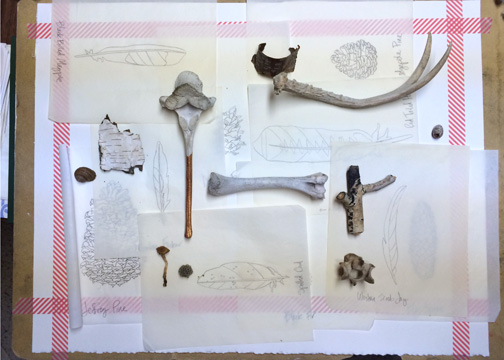
While I had most of the items I needed on hand, I still had to round up a few pieces as a visual reference. It took a while to hunt down everything I needed, and I went on several adventures with the sole purpose of gathering specific items. Luckily, though, in my hunt to find certain objects, I was able to make a few final tweaks to the items included in the painting while still maintaining the important values they symbolized. It all came together and helped me see where I needed to make additional changes to my lineup.

//Display//
As I gathered the pieces for my still life display, I also started assembling it. As I added items, I would rearrange the display. Over the course of several days, I arranged and rearranged the display in order for it to be visually appealing and to make sense compositionally. I even took it apart completely and put it back together during this time. I watched for issues like variety in height, having the colors well-balanced, and keeping a strong composition and kept rearranging until I was satisfied:


While it's important to have a visual reference, I used my display as just that, a reference. I did not exactly copy every single piece and texture found in my display. I knew I was going to change the colors, and some shapes, but I made sure each item was somehow visually referenced so that I could use it to occupy the space and study it more closely when sketching and painting my art piece. I needed a reference in order to ensure my perspective didn't change between items and that all my lines and shapes made sense for the viewer's eye.

//Paper Preparation//
While most fine art pieces are framed after they are created, I had a few large frames hanging around for such purposes, and I picked one that I liked for this particular project. I then re-sized my paper to fit within the selected frame, which wasn't too difficult. I simply trimmed a little off the edges of my paper. With my final paper size established, I then prepared my paper. First, I made sure I was going to be painting on the correct side of the paper. Then, I measured and taped off the edges:


The purpose of taping the edges is two-fold. First, it establishes clean boundaries and ensures the final artwork is centered on the paper. Second, when attached to a board, it keeps the paper in place and prevents warping.

//Sketch//
With my paper sized and placed on a large enough board, I got to work sketching.

I used a large ruler, a graphite stick, and an eraser. I began my sketch by briefly mapping out general shapes, like I showed in this tutorial. I then went over my drawing multiple times, refining and adding details as I went along. I had some added help from my three-year-old, who often likes to sit on my lap and hold my hand as I draw or paint. So, once I had established strong contour lines and various details, I went through my entire sketch and cleaned it up. I erased all the smudges, I lightened the pencil lines because they can easily show through watercolors, and I checked to make sure there weren't any marks outside of my established tape boundaries because I needed that to stay as clean as possible. This is what my final sketch turned out to be prior to painting it in:


//Painting//
Next came the painting. Most watercolor paintings are built from the background to the foreground, but because I was treating this particular piece more like opaque acrylic paints, I could start on whatever object I wanted:


Once the initial color was laid down and dry, I erased as many pencil lines as I could so they wouldn't be a distraction. I made sure to use this painting order to balance my color usage, and I painted all the items in similar colors all at once to make sure I remembered how to mix my paints correctly. I also painted items in the same color simultaneously because it allowed me to work on one object while another was drying before adding more paint layers. Then I moved on to items in different colors:


I knew when I started that I wanted to keep the colors rich and stick to a classic triadic color scheme. Keeping that in mind, I used warm neutrals to support my brighter primary colors:


Once the initial color was laid down, I went over many of the elements again to add dimension, texture, and to smooth out the color:


I filled in every space, and painted multiple layers on each shape and element, adding slight color nuances to certain items, correcting painting errors as I went along, and ultimately achieving the richness and warmth I envisioned:


Next, I added the finishing touches.

//Finishing Touches//
Finishing touches included carefully and methodically reviewing the entire painting, examining every shape and line, and making final corrections. I corrected textures, cleaned up touching lines, added shadows, smoothed out colors, and added a few additional layers of paint. Once the painting was dry, I carefully removed the tape, cleaned up my edges, and signed that puppy! Complete!


//Submitting// 
The artwork process isn't complete, though, until the work is submitted. I had been working on an artist statement throughout the entire process, from idea conception through signing my name. Here's what I wrote:

In the Sermon on the Mount, Christ taught to us to lay up heavenly treasures that cannot be corrupted or stolen. Our spiritual gifts and aspects of personal character are ours to hold, guard, and maintain by carefully sharing and cultivating with intention. During his ministry, Christ taught of many heavenly treasures we should seek to lay up in our hearts. Each item displayed in the painting, while supposedly common, is representative of one of the many treasures we can gather during this life: Faith, the Light of Christ, Industry, Testimony, Forgiveness, Savor, the Love of Christ, Wisdom, Fortitude, Peace, Improvement, the Word of God, and Eternal Life. These items are shown on a mantel because whatever we collect and display in our homes is usually a reflection of what we choose to be most important in our hearts. Our gathered things tend to be driving forces that motivate us and eventually become a part of who we are. Everyday items placed with care can serve as a reminder to focus on the important things we should cultivate. The variations of goodness we collect and incorporate into our hearts may appear seemingly simple, yet they hold the greatest value and are of the highest importance. Through our everyday actions on earth, we can gather a trove of heavenly treasures that can remain with us forever.

*Bonus for reading this far...in case you're curious and to test your guesses, the heavenly gifts represented are:

Faith--plant
Light of Christ--candle
Industry--honey
Testimony--oil
Forgiveness--ombre cloth
Savor--salt crystals
Love of Christ--stick of thorns
Wisdom--owl feather
Fortitude--antler
Peace--white rose
Improvement--mirror
Word of God--pearl
Eternal Life--pine cone

Also, I already knew the dimensions and other requested info, so once the painting was complete, I only had to take photos and send it along. It's such a good idea to do these little things ahead of time instead of scrambling when trying to meet looming deadlines. Framing and additional submission steps will be taken if the piece gets past the first round of jurying.

//Ta-da!//
And that's the process for this painting from start to finish. It represents months of work, and involved a lot of thinking, practice runs, and epiphanies. I loved it, though, and I'm pleased with the path it took, so it was definitely worth it to me.

So, what do you think? Worth the work? Questions on the process? Ponderings on the piece?